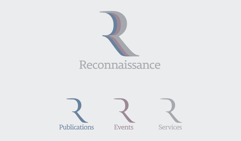
Reconnaissance International – the leading global source of business intelligence on optical and digital security, authentication and traceability, personal ID, secure documents, banknotes and coins – is proud to announce the launch of our new corporate logo as part of our plan to grow and evolve the brand.

The company has been running for over 31 years and as we continue to expand, we have decided that it’s time for a change and a refresh to give our partners and customers a more clear definition of what Reconnaissance is as a company.
The main emphasis of the redesign is to incorporate all three elements of the company’s core activities into one distinctive logo. The recognisable Reconnaissance ‘R’ has been redefined to give it a fresh, sharper and unique look.

The blue ‘R’ represents the publications element. Reconnaissance is a provider of specialist business intelligence, keeping customers informed about the latest developments in the industry through monthly newsletters and publications. We are also a leading publisher of numerous industry reports and directories.
The purple ‘R’ represents the events element. Reconnaissance currently organises and runs 10 events globally, which attract participants from the banknote, identification, product and document security sectors.
The silver ‘R’ – the only colour taken from the previous logo – represents the services element of the business. Reconnaissance offers a range of consultancy services as well as developing and supporting strategic programmes for authentication and anti-counterfeiting. We also manage industry events and associations on behalf of other organisations.

Over the next couple of months, we will be updating all of our marketing materials and websites. If you as a customer or a media partner require the new logo, contact our Digital Media Specialist Philippe Sudan who will be happy to provide you with any requirements.
